Beauty is simple and beauty is in mind
Introduction
Technology www helps people to connect with each other. Knowledge produced nowadays dramatically increase and shared among people. Being able to write an article and sharing your poin of views among peers will be of great values to build your intellectual Personality. But wait, are you crazy on articles formats, pictures and visual effects? I am going to share you with some simple techniques where you can apply to your personal blogs with simple moderate coding. Moreover, if you go through my github pages, you might have found, that writing css is not too hard for u to accomplish.
How does it work?
The most important thing about articles is content. In content centralised media era, we will stick to the content of which the structure is carefully organized. But to digest it thoroughly, we need formats to express it. Formats in this article is implemented using css or sass. They, however, are not a panacea to all conent expressing prblems.
To make full use of it, we have to carry out basic study on structure of conents. Conent has a topic or headline, which will be explained in serveral subtopics. They come either externally or interally. For example:
- External contents: typically called as blockquote.
- non-official references
- bibliography
- convention or best practices
- Interal contents: frequently refered as author’s point of views.
- intro
- body
- introduction
- theory
- example
- instance
- extension
- conclusion
- conclusion
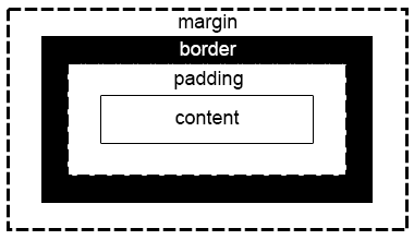
After we establish conents sources, it is our duty to list evidence to support them. These will be expressed inside paragraph. A paragraph has margins, margins to borders, margins inside. there are thousands of Hamlet residing thousands of readers. They are different from people to people.
All these structures now will be implemented by writing css and sass.
What is css and sass?
CSS is short for Cascading Style Sheets. It origins from Oct, 1994 by Håkon Wium Lie, when “he is working with Tim Berners-Lee at Conseil Européen pour la Recherche Nucléaire (CERN).” (wikipedia). After two years preparation, the first standard was released in 1996.
The current popular CSS standard is CSS3. It is used for defining visual effects of html documents. It contains:
- css selectors: Vsual effects will be grouped by class names, tag names, id names or even pyseudo element names. It defines namespaces and algorithms to find them.
- key-value attributes: including box-model, layouts, colors or any other attributes even dynamic anmiation functions which affects visual effects.
- media query: targeted on devices type used to expressing html documents, like tv, mobile, screens and their width and height.
It is not a cure to all formatting tasks. Usually, we use it together with javascript, a simple, hash style weak dynamic typed language. But, knowing more about css will do you a great favor in diesigning appealing web pages effectively.
With more and more complex pages, like, sing page app entering into people’s eyes. Designers find that it is very hard to main css files because it is too verbose. sass/scss is developed to tackle that problem. The similar tools include less. CSS is not designed for programming, while sass/scss is a programming language which compiles to target language css. It is a little like Flex we usually use for compiler development in C++.
Today most css framework is developed by using sass/scss and less. But to understand the target css well, sometimes, we still need to write css directly, especially for simple ones. In this article, we will start from typical css design components, and then explore some important skills to make it better. It organised as following:
- navigation: a navigation bar is used for navigation for readers.
- sidbar menu: this is intensively used by mobile first design to utilize larger spaces.
- list: tiny logical coponent in every css components. With aid of “float” attribute, it makes side bar menu and nav into realities.
- css diary: css design for mark up, which design especially for writing html articles.
- css animation: a sexy lady in css.
- bibliography: to maintain Research Integrity. It is very very important!!!
css layout

The picture shows a canonical css layout (or html layout, but I personally believe that html focuses on logics not visual effects). In HTML, it might look like:
   <body>
        <div id="wrapper">
            <nav>
                <ul class="navbar">
                    <li><a href="/">Base</a></li>
                    <li><a href="/about.html">About</a></li>
                    <li><a href="/cv">CV</a></li>
                </ul>
            </nav>

            <div class="row"> { something } </div>

            <footer> ... </footer>
        </div>
   </body>
I am currently using rouge to hight codes above, but in the future I will develop a toolkit to support lineno in pure javascript. css grids here refer to width and position that whehter they are bump to bump or overlapped.
grids
css grids system consists of three important attributes: position, display type, width. Every element can be devided into two categroies: positioned and non-positioned. Non-positioned elements refer to elements with position attribute value equal to either ‘relative’, ‘absolute’, ‘fixed’ or ‘sticky’. Since they are positioned, a box model will be attached to them.
sample-css {
	position: relative;
	padding-direction: x;
	margin-direction: y;
}
A box model has an important attribute to define width of a box – “box-sizing”. When “box-sizing” set to “border-box”, with a visual box is equal to width definition itself.
CSS key-value definitions group have an identifier called class. In grids system, we usually define css in two groups: row, col. “row” represents a block to start a new line whenever the element contain the class is. “col” will be floated so that sequential elements are aligned horizontally. We will talk about float later. Since device screen is dynamic, we usually use percentage to present width of a col. The simpliest way to define a col is to use arithmetic operations. Hence we use sass to compile to the col css:
$small: 430px

.row
  display: block
  box-sizing: border-box
  @for $i from 1 through 12
    .col-#{$i}
      @media screen and (min-width: 900px)
        flex: none
        float: left
        width: ($i / 12) * 100%
      @meida screen and (max-width: 430px)
        float: none
        width: 100%

.row:before,
.row:after
  content: ""
  display: table

.row:after
  clear: both

.row
  zoom: 1/* For IE 6/7 (trigger hasLayout) */
navigation with sidebar menu (nav)
Navigation and footers typically reside in base template pages for template enging to render so that there is no need to wirte them twice anywhere else. To control it, we focus on four attributes:
parent {
	position: it must be positioned property
}

wrapped-ul {
	list-style: usually set to none
}

parent li {
	float: valid or none
}

parent li > a {
	text-decorator: none
}
float targets on parent elements in the direction specified. The problems of float is that elements after it will surround it. Hence, we need to clear float effects after a floated element. There is a neat css design so that we won’t deal with this problem every time by using standard clear formats.
targeted:before,
tarteted:after {
	content: "",
	display: table
}

tarted:after {
	clear: both;
}

tarted {
	zoom: 1
}
Our design is of course dependent on devices. If we want to combine different design together, we need variables to track devices status. Here comes media query part.
@media device-type and conditions {
	/*your designs are here !*/
}
Once we have media query, we can have “vertical nav” and “horizontal nav” simutaneously!
- Vertical Nav: when float set to none
- Horizontal Nav: when float is everything but none
Horizontal bar wil be easy to deal with. Vertical is much harder. We need animation and movement to implement begin and end postions and their connections kinetic movements. To make possible, in historical approaches, we have two solutions:
- margin movement with animation (works well with relative positioned elements)
- postion movements when the parent is absolute positioned.
I personally prefer the second plan because I don’t need to change parent position style.
list
List is simple, but nested list is not simple. For most application, we need to set “list-style” to none and add indentation. But what if we are dealing with nested lists?
Recursive Conquer + Javscript
Most frustrating problems of css is that we cannot select a parent based on its children type. We have no choice but to use javascirpt to do it. Later, I will introduce you pure a javascript plugin so that you can execute a task on the elements you want. But now, I will stick to css temporarily.
li+ol {
/* Recursively Conquer */
}
Notice to above language, that it is actually recursively defined. The only limitation is that css does not allow too much variables (we will talk about variables later in auto indexing section). We can use Javascript! Here is a snippet of my codes you can refer to
/**
 * Created by wangyi (yiak.wy@gmail.com) on 2015.
 * Updated by wangyi (yiak.wy@gmail.com) on April 23, 2017
 */

(function (factory) {
   if (typeof define === 'function' && define.amd) {
      // Loading from AMD script loader. Register as an anonymous module.
      define(["jquery"], factory)
   } else if (typeof define === 'function' && define.cmd){
      // CommonJS, for seajs users
       define("jsInj",(function (factory){
           // tradeoff between factory and CJ standard
           return function(require, exports, module){
               return factory(true, null, require, exports, module)
           }
       })(factory));
   } else if (typeof exports === 'object') {
      // CommonJS
      var jsInj = module.exports = factory(true, require);
      jsInj.trigger_func = function(){}
   } else {
      // Browser using plain <script> tag, test environment
      factory(false);
   }
} (function (isCommonJS, fs) {
	// fs is for node users
	isCommonJS = isCommonJS === true;
	// ============================= plugin def  =============================
	var VERSION = '0.1.0',
		NAME = 'jsInj',
		AUTHOR = 'Lei Wang',
		EMAIL = 'yiak.wy@gmail.com';

	var $jsInj = function (settings) {
			_classCallCheck(this, $jsInj);
			_init(settings);
        },
        global = (0, eval)('this');

	...
	...

	function extend(_array){
		Array.prototype.push.apply(this, _array)
		return this
	}
	Array.prototype.extend = extend

	// ================================ application ================================
	function remove_scripts(){
		var node = walk_dom(document, function(parent,
												children) {

			var selected = []
			for (child of children) {
				if (child.nodeName === "SCRIPT" || child.nodeName === "STYLE") {
					parent.removeChild(child)
				}
				else {
					selected.push(child)
				}
			}
		   	return selected
		})
		// for interprocess communication
		console.log(node)
		bodyText = node.body.innerText,
		body = node.body.innerHTML
		bodyText = bodyText.split('\n').filter(function(node){
			if (node === "" ){return 0} return 1})
		return "success"
	}

	function wrap(tag, cls) {
		var doc = document,
			root = doc.querySelector("div.post")
		var node = walk_dom(root, function(parent,
										   children) {

			var selected = [];
			for (child of children) {
				if (child.tagName == tag.toUpperCase()) {
					var ori = child.outerHTML
					child.outerHTML = '<div class="' + cls + '" alt="' + child.alt + '">' + ori + '</div>'

				} else {
					selected.push(child)
				}
			}
			return selected
		})
	}

	return $jsInj;

}))
pseudo elements & inhertantce
In HTML standard we have various kinds of elements, pseudo elements refer to elements cannot be manipulated by DOM standard. Pseudo elements can only work on normal elements which have children definition. For example, you must not sepcify them upon “img”, “hr” tags and so on. They have two operators:
pseudo insert
selector:before {
	content: "must valid"
	display: table, block ...
}

selector:after {
	content: "must valid"
	display: table, block ...
}
The codes above will insert a pseudo element with style specified.
pseudo selector
selector::after {
	/* change styles here */
}
The codes above will change pseudo elements with style specified.
/* these codes are invalid because pseudo elements can not be manipulated by DOM */
query = "selector::before"
doc = document
pseudo = doc.querySelector(query)
The codes above in javascript are invalid because we were trying to manipulate pseudo element through dom. In summary, pseudo elements rendered by css and can not be manipualted by DOM and can not be inserted into an normal elements without children.
css diary
css diary or css post in this article refers to the tiny group html tags defined by mark up language. By defining css of these group tags, we are able to write articles just in markup and have miracles easily. However, we don’t usually define css class names in this part because mark up does not contain css namespaces. Hence the design should be universal, natural, and simple.
Here are my techniques used:
- wrap articles in classified tag for mark up post, so that we have a namcespace
- focus on basic elements design by refering to some popular design like typo.css
- the simple is the best.
I am going to cover two important parts:
- auto indexing
- header indexing
- tables or figures indexing and refering
- paragraph optimization
auto indexing
Header indexing and figures indexing are similar, I will only cover header indexing, because it is much more complex.
header indexing is complex because lower headers indexing are dependent on upper ones. Here I use sass @for loop to process the logcis and css built-in variables.
@for $i from 1 through 12
  h#{$i} + p
    margin-top: 0.3em
  h#{$i}
  div.post h#{$i}
    counter-increment: index#{$i}
    counter-reset: index#{$i + 1}
  div.post h#{$i}:before
    @if $i == 2
      content: counter(index#{$i})
    @else if $i == 3
      content: counter(index#{$i - 1}) "." counter(index#{$i})
    @else if $i == 4
      content: counter(index#{$i - 2}) "." counter(index#{$i - 1}) "." counter(index#{$i})
    @else
      content: "sub" counter(index#{$i})
    display: table
    float: left
The clever readers must have noticed that we define a css variable indexi. In sass it will be referred by using string concatenation index#{$i}. counter-* are a series built-in functions for variables increasing and evaluating.
Using the the same techniques, you can implement figures auto indexing quickly. If you feel that the post is useful, don’t forget to share with your friends (I will integrate sharing services later)
paragraph optimization
The only sentence I want to say is that “header has a large margin-top and smaller margin-bottom; while, paragraph only has margin-bottom.”
css animation
Simple animation can be accomplished by using css3 animation functions like kinetics movements programming (inverse kinetics algorithm for example). More sophisticated animation can be programmed using WebGL. If you have ever done anything pertaining to OpenGL, that is not hard because WebGL is equivalent to
while (true) loop {
	responding to devices
	redrawing each shapes in matrix stack
}
In javascript, you can implement you gl codes in pure javascript can casting them to canvas tags, which support shading, lighting, viewport-camera concepts.
bibliography & latex
bibliography
Bibliography is used to maintain Research Integraty so that other researchers can trace back your ideas sources and formulate new ideas. It also gives credits to every author who contributed to the knowledge represented in an unambiguous manner. Widely used in latex based papers, it should support references rendering and reference.
To design bibliography, we have to learn about standard BibTex manner
/* from stackoverflow */
@misc{Charles2013,
  author = {Charles, P.W.D.},
  title = {Project Title},
  year = {2013},
  publisher = {GitHub},
  journal = {GitHub repository},
  howpublished = {\url{https://github.com/charlespwd/project-title}},
  commit = {4f57d6a0e4c030202a07a60bc1bb1ed1544bf679}
}
We can maintain bibliography in this format and write a parser to render it into html. In HTML, we basically need a javascript widget to maintain references. For example:
$.jsInj.wrap(pattn, linktag)

/* or even more straightly using regex parser */
function bibiliography(fmt) { /* fmt is what we see above */
	fmt.replace(/Token1/g,
				/Token2/g, /* language lexer */
				... , function (mtch) {
				/*parser response*/
				return mtch => tags
				})
}
latex
Latex is a standard language for academic writing and mathemtics formatting. I recommend you to use MathJax services.
combine them in mark down post
Jekyll has already done a very good job! To put them together, you have to install ruby and Jekyll to get some basic services like liquid templating engine, router adaptor and so on. Github page has limit support for Jekyll plugins, as a result I suggest you programming in pure javascript. You can have different version for development, one for local server testing and one for github to render by using git version system.
references
internet sources (Retrived on 23th Aug 2017)
- https://www.w3.org/Style/CSS20/history.html
- https://en.wikipedia.org/wiki/Cascading_Style_Sheets
- https://github.com/mojombo/tpw/blob/master/css/syntax.css
- https://typo.sofi.sh/
official publications
Pending
thanks to
- gladuo
- 泡夫子 (front end expert in Didichuxing)
one more thing to add …
…